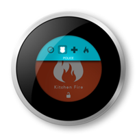
Immersion Demo App Icons
-
- Immersion Corp
- Mobile World Congress
- 2014
Selected Iconography
Below shows the latest application icons for several of Immersion's demos down publicly.
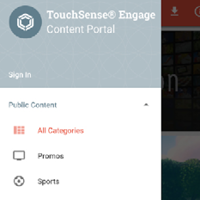
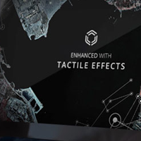
Content Portal [Project Page]
The Content Portal icon uses iconography designed to represent haptics flowing in all direction. The two chevrons in each third represent the emanation of vibration and was most popular when tested with alternative iconography.
Future of Wearables
This icon was designed for an application that demonstrates forward looking haptics in a wearable context. Using an analog watch face as the comon theme for the wearables demo apps (also Language and Design), the Future icon was designed to show a rising sun on a horizon formed by the minute and second hands.
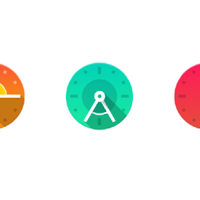
Wearables Language
Wearables Language is a demo that shows Immersion's Instinctive Alerts Framework as a psuedo-language for haptics. Including the previously mentioned analog watch face as a common theme, the minute and second hands create an A with their arrangement.
Wearables Design
Wearables Design is the final wearable demo app in the suite. The intention was to show the the design implications of haptics in wearables, which is why the minute and second hands form an artist's compass.
Tactile Showcase
Tactile Showcase as the application an attendee of Immersion's MWC2015 booth would be able to download with a customized haptic track. It was designed to show a mobile device bearing the haptic "wave" logo held by two hands.